Selected work
Brand identitySelected logos
Logo & Identity Design
A selection of logo marks from my graphic design work — monograms, symbols, and wordmarks — from the Titustoy brand to businesses in travel, transport, real estate, fashion, hospitality, agriculture, and technology.
- Context
- Selected from my graphic and branding design work. Shown as design work, not as client endorsements.
- My role
- Logo and identity design
- Scope
- Logo designSymbol & monogram designTypographyConcept exploration
The need
A logo has to say something specific about a business in a mark that still reads at the size of an app icon or a business card — and works when it is printed in one colour.
Selected marks
TitustoyToys & ecommerceThe logo for my own toy store: a child holding a balloon beside a rounded, multicoloured wordmark — friendly, readable at small sizes, and used across the Titustoy storefront. 
Face to FaceSymbolTwo profiles facing each other create a single chess-piece silhouette through negative space. 
One to OneSymbolThe 1:1 ratio is set inside an open circle, combining the name and the idea of a one-to-one relationship. 
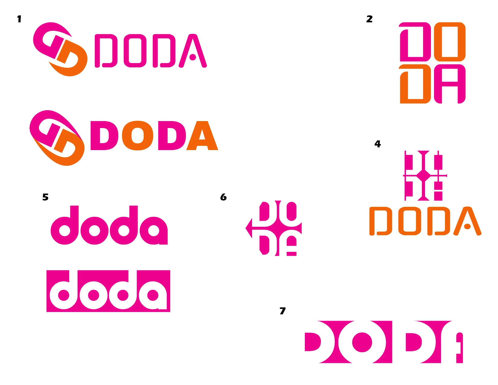
DODABusiness servicesTwo interlocking D forms create a bold, symmetrical mark, paired with the line “Everything Your Business Needs”. 
Srujan Web TechnovisionWeb technologyAn angular “S” monogram in two colours, with the full company name set beneath it. 
BlogworxBlogging platformA “b” built from blocks and a single circle; its red and blue run through the Blogworx interface design. 
Love Bird — Pawna Lake CampingCamping & hospitalityA dove carrying a branch, with a playful serif wordmark and a clear location line. 
Cloud 18 HolidaysTravelTwo colour treatments of a circular “18” mark, exploring a warm and a cool direction. 
Auto SavariTransportAn auto-rickshaw drawn in a few confident strokes, with the wordmark set below it. 
FarmpalAgricultureA small identity system: the “fp” monogram with a sprouting leaf, a boxed version for the mobile app icon, and a wordmark for the website. 
Eva FashionFashionThe “E” sweeps up into a woman’s profile and flowing hair, above a widely spaced “Fashion” line. 
Tech HomesReal estateThe “H” is drawn as two tower blocks and the “O” as a power symbol, joining property and technology in one wordmark. 
City Moving AdsAdvertisingThe letters “CTY” become a vehicle in motion, with speed lines and wheels, for an on-the-move advertising service. 
Elite Laser TechLaser technologyA dimensional “E” with a radiating burst of light, suggesting precision and energy. 
Atlanta Orient GroupBusiness groupA two-tier wordmark: the name in a bright band above a letter-spaced “Group” bar. 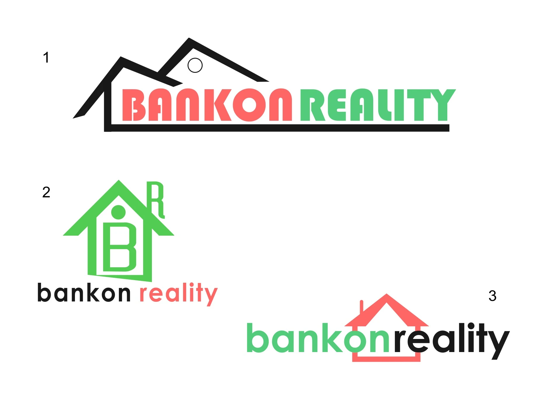
Bankon RealityReal estateThree concept directions built on a house shape — a roofline over the name, a house-shaped “B” monogram, and a roof set into the wordmark.
Design decisions
- One idea per mark
- Each logo is built around a single concept — two faces forming one shape, a ratio inside a circle, a letter drawn from basic geometry — rather than several competing ones.
- Geometry over ornament
- Monograms such as Blogworx, DODA, and Srujan Web Technovision are constructed from simple blocks, curves, and angles, which keeps them crisp when they are small.
- Explore widely, then reduce
- Concepts start as a sheet of directions. The DODA exploration shows several routes — stacked letters, ligatures, symbols — before one was refined into the final mark.
- Use negative space
- In Face to Face, two profiles facing each other also form a single chess-piece silhouette, so the empty space carries the meaning.
Process
What the selection shows
- Sixteen marks — symbols, monograms, and wordmarks — across retail, travel, transport, real estate, fashion, hospitality, agriculture, advertising, and technology.
- A logo adapted into an app icon and a website wordmark (Farmpal).
- Concept exploration through to a refined final mark (DODA, Bankon Reality).
- Marks designed to work at small sizes and in limited colours.