Homepages and inner pages for businesses in recruitment, agriculture, education, and food — designed to explain an offer quickly and lead visitors to the next step.
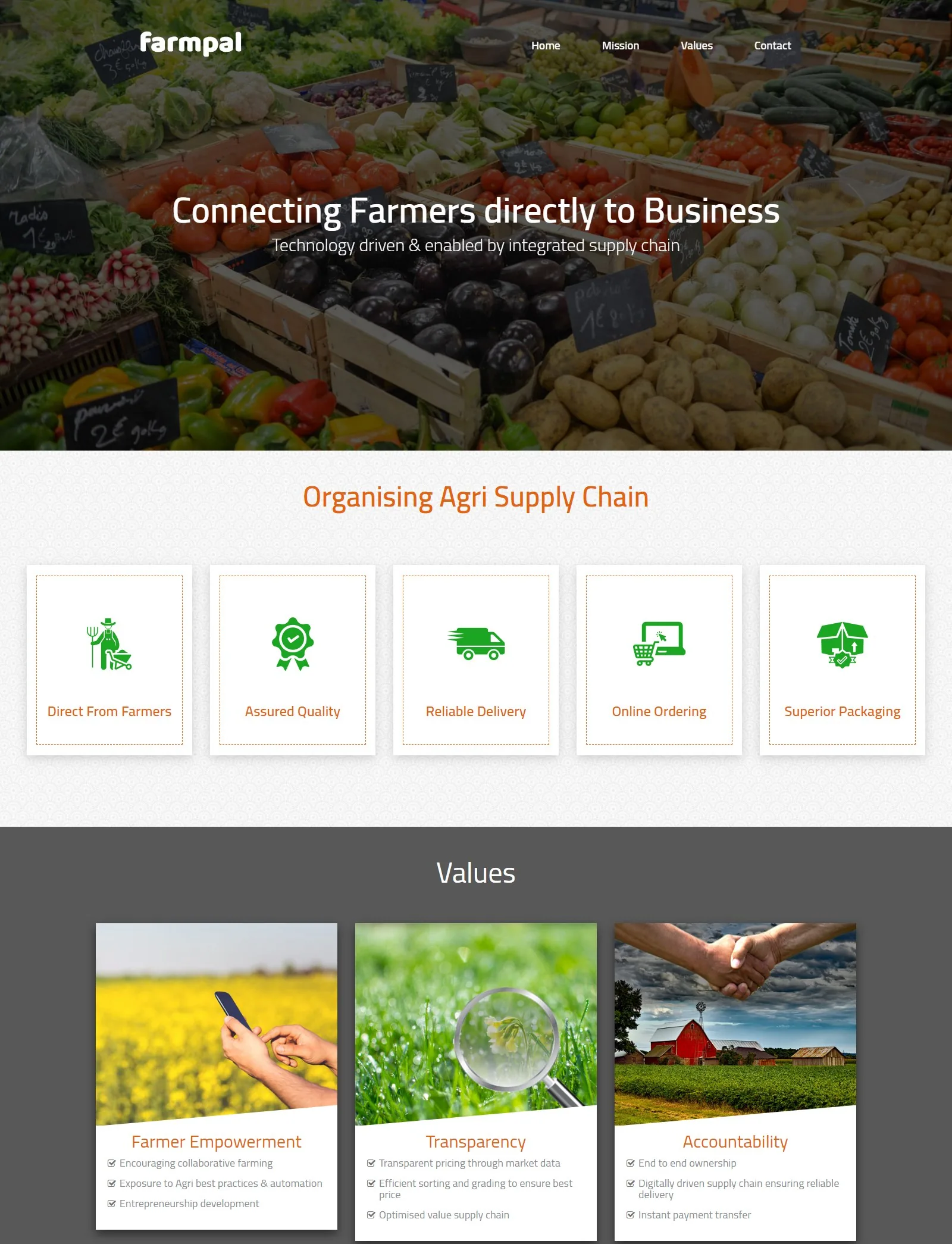
Farmpal homepage. A one-line promise over a full-bleed photo of fresh produce.
The need
The goal for each site was to answer a visitor’s first questions — what is this, is it for me, what do I do next — within the first screen or two.
Design decisions
Lead with one sentence
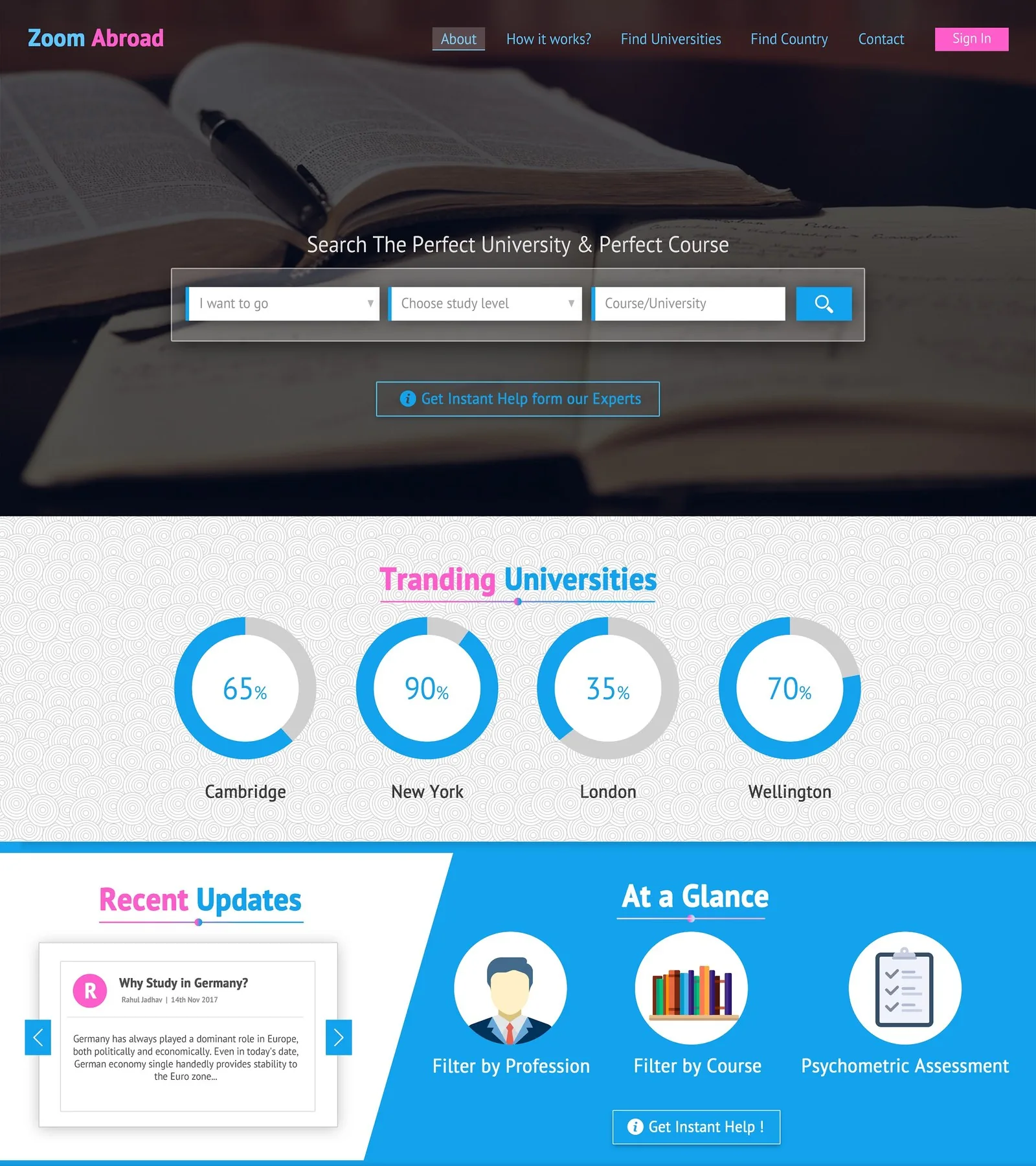
Each homepage opens with a single headline that states the offer — “Connecting Farmers directly to Business”, “Search the Perfect University & Perfect Course” — before any detail.
Services as scannable icons
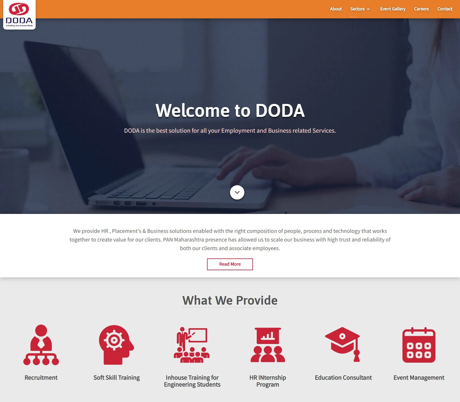
Offerings are broken into short, icon-led items (DODA’s six services, Farmpal’s five supply-chain steps) so visitors can find what applies to them at a glance.
Put the main task first
Where a site exists to help someone do something — like finding a university — the search form sits in the hero instead of further down the page.
Brand and site designed together
For DODA and Farmpal I designed the logos as well, so colours and icon style carry straight from the mark into the website.
Screens
Farmpal, full homepage. The promise, then the supply chain in five steps, then the values behind it.
DODA. A short introduction and six service icons in the brand red — the same red as the DODA logo.
Zoom Abroad. University search is the first thing on the page, followed by trending universities and ways to filter.
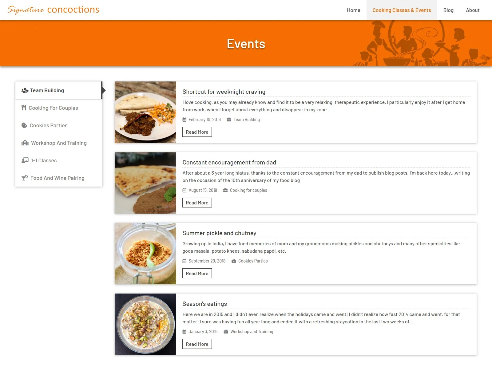
Signature Concoctions. Cooking classes and events filtered by type, with photo-led cards for each event.
What the designs cover
Homepages for recruitment, agriculture, education, and food businesses.
A listing page with category navigation.
Logo and website designed together for DODA and Farmpal.